

How I Create My Own “Ads” On Substack
With a free tool

We have all been there.
We are writing a great post on Substack. We have a product to share. Maybe it is our own product, book, or service.
Maybe it is a book we loved and want to share via an affiliate link.
We want people to click it. We want them to see it. But we do not want to be too annoying. After all, we almost all hate ads, but we do like to make some money, right?
Most of us just use the standard Substack button to share something on Substack. Or even just a simple text link.
And it is fine. It works. Nothing wrong with that.
But it gets repetitive. If we see the same colored button in every single newsletter, our eyes start to gloss over it. We stop noticing it.
It is basically banner blindness, but for buttons.
I wanted something better. I wanted something that looked like a “native ad” in my brand-design. I wanted a visual card that displayed the product image, a headline, and a short description.
Simple, but visually appealing. Not like AdSense ads.
I am a web designer and developer. I did not want to open Canva or Figma every time I needed a simple link card.
Too much friction.
I wanted a tool that did one thing and did it well. So I built it myself.
Here is how I create my own “ads” on Substack using my tool, CardGen, and how I use it to drive more clicks to our products.
The “Visual Ad”
Text links are great for flow. They fit right into a sentence. But they are easy to miss.
Buttons are better, but they lack context. A button just says “Get this.” It rarely tells us why or shows us what it is. It can, but button text length is limited.
A card does both. It gives us visual context (the product image). It gives us textual context (the description). It creates a dedicated space in the newsletter for that recommendation.
When we treat our own products or recommendations with this level of design care, we show our readers that we value these things.
It looks less like a plug with little value and more like a curated feature.
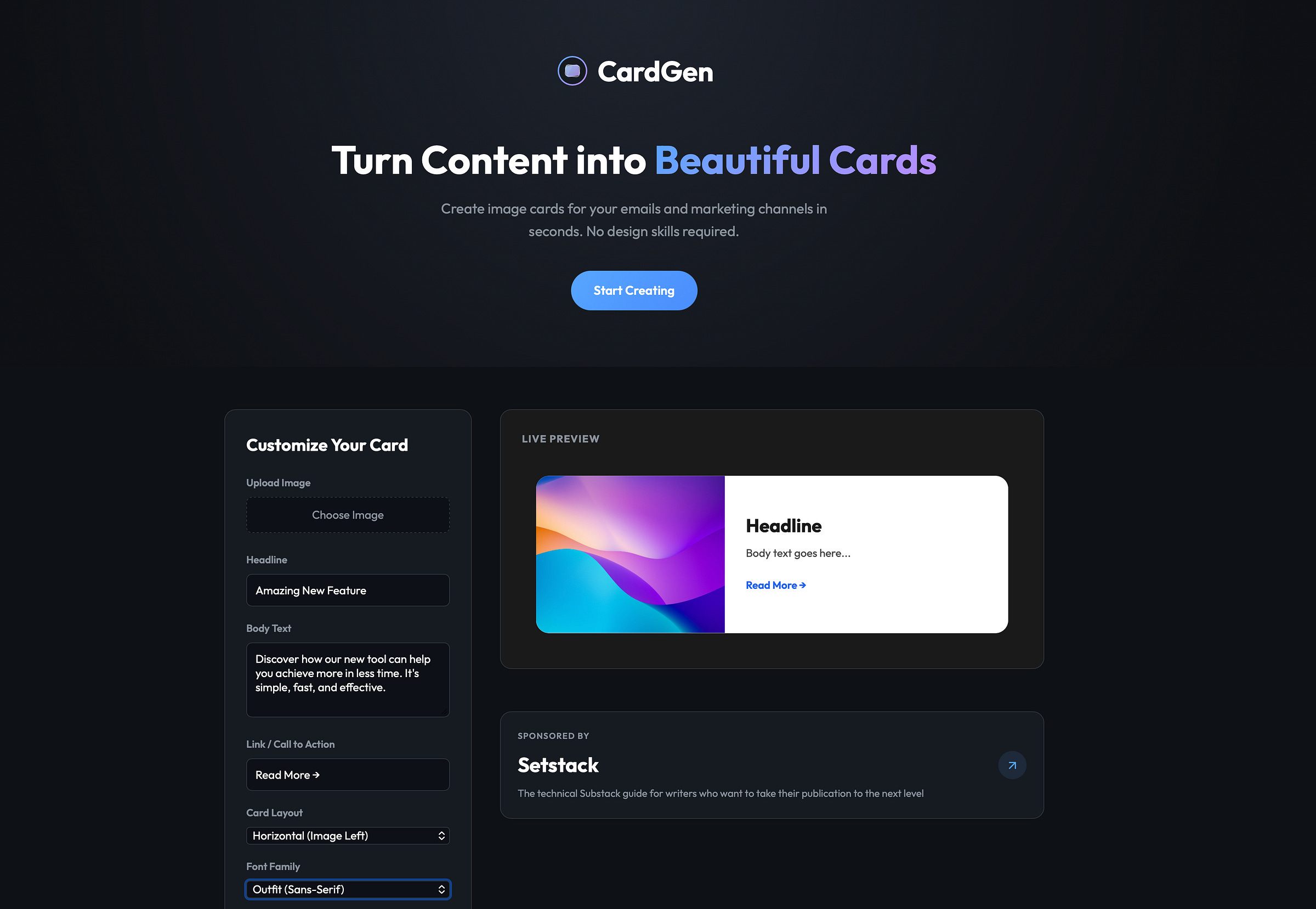
The Tool
I created a simple web tool called CardGen (cardgen.byburk.net) to solve my own problem.
I needed a way to generate these image cards quickly. I didn’t want a subscription. I didn’t want a login. I just wanted to type, upload, and download.
The tool allows us to create two main types of layouts:
We can do a horizontal layout where the image is on the left and text is on the right. This is great for desktop viewing.
Or we can do a stacked layout where the image is on top. This works well if we want a big visual impact. (Also looks better on mobile).
It lets us customize fonts, colors, and borders to match our newsletter’s branding better. If our Substack uses a serif font, we can select “Playfair Display” to match it more closely.
Step 1: Preparing the Content
The first thing I do is pick the product. Let’s say I want to promote a new notion template I sell on Gumroad.
I need three things:
A clear image. Usually, this is the cover art of the product.
A strong headline. Short and punchy works best.
A short description. One or two sentences explaining the benefit.
We should keep the text short. This is an image, not a blog post.
Step 2: Designing the Card
Now I head over to
https://cardgen.byburk.net/
I start by uploading the product image. The tool renders a preview. Next, I type in my headline and body text. I usually stick to the “Horizontal” layout because it feels more like a link preview.
Then comes the styling. This is where we can make it fit our brand. I usually tweak the background color.
If I am sharing an affiliate link (something that is not my own product), I toggle the “Add Sponsored Tag” option. This adds a small “SPONSORED BY” label at the top. It is a quick way to be transparent with our audience (and comply with laws). We never want to trick people into clicking.
Once I am happy with how it looks (I check the live preview on the right), I click “Download Card.” It saves a PNG to my computer.
Step 3: Integration into Substack
This is the easy part.
I go to my Substack editor. I find the spot where I want the ad to appear. Usually, this is about halfway through the post or right at the end.
I drag and drop the PNG file I just downloaded into the editor.
Now, this is the most important step. We must link the image.
By default, clicking the image in Substack just opens the image in a lightbox. We do not want that. We want it to go to Gumroad.
In the editor view, click the image to select it. Then click the “Link” icon (or press Command+K / Ctrl+K). This opens the link popup. I paste my Gumroad or affiliate URL there.
Done.
Now, when a reader clicks that card, they are taken straight to the product page.
Why This Works (And What to Watch Out For)
I have found that these cards get higher click-through rates than standard text links. They break up the wall of text. They act as a visual break for the reader.
However, we should be balanced. We should not put ten of these in a single email. That will look like a spam folder nightmare. One or two per post is the sweet spot.
We also have to remember that this is an image. If a user has images turned off in their email client, they won’t see it. That is why I usually make sure to include a standard text link somewhere else in the post, or I use the image caption feature in Substack to add a text-based “Click here to view” link just in case.
Also, since the text is part of the image, it is not searchable. We shouldn’t put critical information only inside the card. The card is the hook. The post content is the meat.
The Bottom Line
We spend a lot of time writing our content. We should spend a few minutes ensuring our product plugs look just as good.
Using CardGen simplifies this workflow.
Give it a try next time you have something to share. It’s free to use.
I love this and I started using it recently, thank you so much!
I started trying CardGen a few minutes ago.
Although a slow learner, I hope to soon be able to make the most of it.